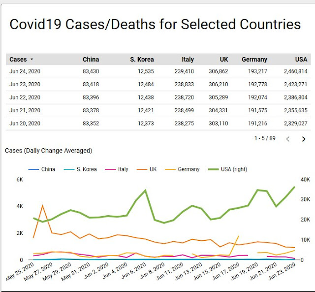
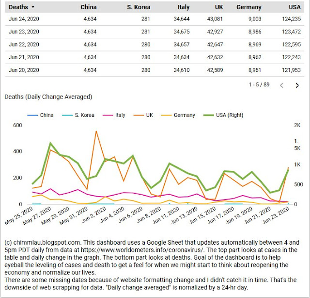
Looking over at the Coronavirus tracker I have built (details on its data source, automation, and construction here), the data certainly fits the recent news narrative that cases are increasing. The silver lining is that the number of daily deaths hasn't increased (yet) though still tragically high. Over the last 10 days, Worldometers's data reports an average of 597 deaths a day for the US.
Update 20200718. The graph in my dash is getting hard to read even for me. I like it that way because it makes identifying data issues easy. Nonetheless, I have changed my dash to show moving average of daily cases and deaths instead.
Update 20200718. The graph in my dash is getting hard to read even for me. I like it that way because it makes identifying data issues easy. Nonetheless, I have changed my dash to show moving average of daily cases and deaths instead.
My dashboard data source
I just realized that I haven't shared the underlying google sheet data that the Google Data Studio dashboard uses. The data scraped from Worldometers.info is here. You can use it to build your own dash and include countries you are personally interested in. (I only included the countries I'm interested in for my dash.)
The data page at https://www.worldometers.info/coronavirus now also has graphs on daily cases and deaths -- though they are aggregated at the world level instead of at the country level like my tracker. I'm not going to embed my dash in a post again, but the link to my tracker is here. (20200718. Updated version plotting moving averages is here.)
California data
With the concerning increase in cases, I am more interested in the local situation (California San Francisco Bay Area) more than ever. Thankfully, (San Jose) Mercury News now publishes a tracker for California here, saving me from trying to aggregate the data from county health departments to make a new dash -- which can't be automated easily unless the data is already aggregated by someone. The only issue I have with the Mercury News dash is the lack of option to have just the Bay Area counties selected, and so I would have to manually do it each time I check it. This is one reason I didn't build my dash to allow for selection of different countries.
The California data, as of the time of my post, mirrors that of the national level -- cases are increasing while deaths remain steady (for now).
Other Covid dashboards
Here are some other additional dashboards I look at from other sources.
- Mercury News: Cumulative cases, deaths, tests per 100k residents (California by county)
- I linked this source in the prior section. But I like this dash in particular since it normalizes the data.
- CA.gov: COVID-19: Hospitals (California by county)
- This is a Tableau Viz. A lot easier to select specific counties than the Mercury News verison.
- "The ICU & NICU Available Beds" number is important. If this drops too much, I would expect death to jump.
- CA.gov: COVID-19: Cases (California by county)
- SFBayCA.com: Bay Area coronavirus deaths (Bay area by county)
- Updates lag sometimes but it lists data by changes per day and is Bay Area focus.
- SFBayCA.com: Bay Area coronavirus cases (Bay area by county)

